Showing posts with label web design. Show all posts

Monday, April 21, 2008

Contact details

Unfinished businessImage by BR0WSER via FlickrIs this an issue for SEO, or web design?

Recent surveys of online buyers indicate they will spend less than 3 minutes searching for a way to communicate with the company.

Even business owners new to the Net know. I don't know how many times I've heard an SEO client tell me to make the logo bigger (because it has the contact phone number) or to put the phone and email both at the top and bottom of the page. The look is intrusive, yes. It is also good business.

MaCorr Research, working with web hosting firms offering web design, reports that "77% of respondents will switch to a competitor if the business does not provide a phone number, e-mail address or live chat."
Consumer expectations drive the need for businesses to provide a means of communication.

  • 85% of the 1,025 respondents cite the ability to contact a business as the most important aspect of using a company’s web site.
  • 78% are irritated when unable to find a way to communicate on a business’s web site;
  • 48% have felt angry to the degree they tell someone about the failure. 91% are most irritated when unable to find a contact phone number,
  • and 82% when unable to find a contact e-mail address.

After successfully contacting a business:

  • 97% of survey respondents say they would visit the web site again and use the business in the future;
  • 93% say they would use the business more frequently,
  • 92% would recommend the business to others
  • and 85% would bookmark the site, the survey finds.
I have to say that I distrust those numbers, frankly. They're just too high. Or there is no commitment indicated. I'd have to question the participants of the survey, and how it was worded.

SEO/SEM in Australia is a special issue for so many reasons. Join me was we explore. It will be a fascinating and informative journey. Sphere: Related Content

Sunday, April 6, 2008

One Keyword per Page

A license plate seen in the Googleplex parking lot.Image from WikipediaSearch Engine Herald ran an article by Noel titled "SEO Basic - One Keyword per Page" which stuck in my mind for a bit, so I posted the following comment:

What do you mean by ‘optimizing’ when you say one keyword per page?
The LSI process tracks the use of associated terms to interpret the subject of a page. If you define ‘optimization’ as terms within the 2%-15% keyword density (some people target 5%-12%), then the goal of optimization would be to get as many of the commonly associated terms into that range - not just one keyword.
Whichever range is used, getting just one keyword (or phrase) into that range dictates some very short pages. Google once looked at only the first 250-500 words of content in order to build up their index quickly, that’s true. That was a few years ago.

The result was many SEO people writing a lot of short pages that resembled intrusive advertising as opposed to truly relevant information.

But Google has changed its perspective recently to favor pages with around 1000-1200 words, which arguably allows for more pertinent information.
Many business websites find it difficult to find 500 words about a category or product, much less 1000, which reflects Google’s long-standing policy to return SERPs which favor information as opposed to sales pitches.

The article is on SEO basics. My comments took the subject matter a little further. I just didn't think this short article was being very clear, that's all.
I'd just finished a keyword density analysis on a homepage. There was one word on the page that was within the indicated range. I'd rewritten the page to have 17 words and phrases within the 2-15% range. All but one of the terms clearly pertinent to the topic and the goals of the homepage.

Homepages can be difficult for SEO.
A company may provide a number of services and products that need to be presented along with a brief introduction to convey the attitude and quality of the business.
The Value Proposition of the business is often expressed in a slogan that is not commonly associated with the type of business.
The wider the distribution of services and products, the more the keyword density will be diluted. This is the challenge of SEO and web design.

It's much easier to get the right mix of keyword density for a page on a category of services and/or products; or for a particular service or product. Although finding 250+ words to say about some products can be difficult too.

LSI can actually make writing relevant pages easier, too.
A little research can reveal a number of associated terms on most topics, which means the text can flow more easily and include greater detail without losing relevancy. In fact, using the right combination of terms can make the page more human-readable and more relevant.
Complexity isn't always a negative. Humans are complex. I suppose it could be said the complexity of content has to match as closely as possible the complexity of the target audience.

The complexity offered by LSI and longer pages poses the challenge of writing content that is still scannable. Web users still scan the page. Very few read more than about 55 words or so.
Visitors can be induced to read more of the content by good presentation and interactive content, but that has its limits. A great deal depends on assumptions about the type of traffic the site will draw, and the marketing goals.

Australia
Is it fair to tell a DYI web designer to try to target only one keyword or key phrase per page?
Part of the answer depends on the locale. The article referenced above was written for the US market, where competition is fierce. Content designers in the US market have to contend with a more balanced apportioning of the search engine market.
In Australia, Google with LSI still controls 80% of the search traffic. That's really the basics in this market.
Australian web designers must write for the cutting edge technology, or seek traffic elsewhere. Most Australian sites are designed to be marketed within Australia and New Zealand.; if not regionally within Australia.

SEO/SEM in Australia is a special issue for so many reasons. Join me was we explore. It will be a fascinating and informative journey.
Sphere: Related Content

Thursday, March 27, 2008

Questions and Answers

One of my regular readers sent me a critique.
Your posts are very informative. You ask a lot of good questions, but don't seem to have the answers. - preferred to remain anonymous
Looking over my last few posts, there's something to the critique.
In my own defense, I've got to say I think asking the right questions is the best way to find the answers. That may sound like running to the high ground to some. That is how I think though. Despite training and experience as an analyst in technical work, I've learned my mind is geared right-brain. I'm an intuitive thinker. My Kiersey surveys confirm it.

Some of the questions I've asked were more to point out issues to be aware of, to see how they work out. For example, how Universal Search will affect SERPs and useability issues is open to conjecture at this point. We're just going to have to wait and see.
Many times, answers to questions would only be anecdotal. A case study might help clarify some issues, but realistically every website and business has different goals and requirements. The answers depend upon many issues like:
  • The integration of the website in the business process;
  • Is the company or website established itself on the Web?;
  • The technical skills of the owner?;
  • Is the website ready to be marketed?;
  • What sort of marketing will be efficient within the advertising budget?;
  • and many others both more general and more specific.
Case studies can be impressive. I'll probably include a couple at some point. But unless the case study involves very similar circumstances, they're only there for bragging rights.

Her critique is valid. It calls into question my problem-solving abilities; and my presentation of the company on this blog.
She wants to see definitive answers. That's a valid concern for prospective customers, and has come to be expected by consumers from those who purport to be gurus or experts.

Problem solving
Because I'm usually involved in technical problems where the customer doesn't know the terminology much less understand the concepts involved, I've use established methods to document my problem solving efforts.
For clarification of an issue, I'll use Is-Is Not lists. To illustrate the process, I'll use the 5 Why's system. Both methods are easy to understand and intuitive.

In Project Management, the 5 Why's method organizes and documents brainstorming sessions. In marketing, it allows my Customers to think like their Customers - Consumers.
Asked why Consumers should use their products or services, a Customer will go into some depth about the quality of their products and their qualifications to provide their services - but that is rarely why Consumers buy. Consumers buy because their products and services meet a Consumer need or want. Asking 5 Why's usually elicits much more marketable terms and scenarios.

The best part of using these methods is they present topics which can be questioned.
At best, the results build Customer confidence. The give and take of questions becomes a team building exercise. The Customer becomes actively involved in the planning and process. Synergy builds. After all, my Customer is the expert in their field. I'm listening to the best expertise available: my Customer.
Synergy doesn't always happen. But it is always worth a shot.

Conflicting Styles
Because of the wide range of technical expertise in my Customers, I've developed two conflicting styles to present my SEO/SEM efforts.
One, is to just present my conclusions and state the steps necessary to solve the problem. Essentially: Just do it.
Personally, I'm uncomfortable with this style, but it is the only thing that can be done when the Customer's attitude or circumstances demand it. This approach is always problematical.

Marketing a website is not an exact science. It's a process. And involves a little luck.
Luck in this case is defined as where Opportunity meets Preparation. All I can really do is make the site as ready for the Web as possible; which includes offsite marketing as well as page design and content.
For Customers who demand to know exactly when it will all happen, the process is frustrating. The best I can do is present the efforts of me and my team in steps, and emphasize the achievements as they happen.

My preferred approach is to involve the site owner, either directly or through the assigned liason person(s), in the process. I prefer a dialogue between myself and my Customers. This empowers my customers as they learn. It's not possible to discuss everything in depth. I tend to emphasize the steps that the customer can see, just as for those who want a 'Just do it' style.
I've gotten two critiques of this style:
1) All you're doing is teaching your Customers what they need to stop employing you. - A very Australian perspective.;
and 2) You talk (or explain) too much. I tend to write long emails explaining issues and tying many concepts together. If someone wants to know what I'm doing and why, I'll take the time to tell them. I prefer educated Customers.
My preferred style comes from California. It has proven problematical in Australia, especially with small business owners.
This blog is my way of getting my thoughts out. It probably spares my Customers a lot of eye strain.

Do I have all the answers? No. Anyone who pretends to have all the answers is like SEO companies that offer guarantees - best to be avoided.
I'm not going to pretend to be omniscient or clairvoyant. The Web changes constantly. The best anyone can do is try to keep up. That's what keeps the work fascinating and challenging.
Can I support my conclusions? Yes, usually in some depth. In most cases, I can even document my thinking. Some issues are easy: Every site needs SEO. Other issues are open to experiment and conjecture: Is it better to have wide registration or PPC? The answer depends on the company's market position, long-term and short-term goals.
I wonder if I've answered my critical friend.

SEO/SEM in Australia is a special issue for so many reasons. Join me was we explore. It will be a fascinating and informative journey. Sphere: Related Content

Wednesday, March 26, 2008

SEO Illustrations

After piecing together the post on Universal Search, I decided to take my own advice to see how others had illustrated the SEO/SEM process. It's harder than you think to illustrate a 3-dimensional, really 4-dimensional, process for those who are not at least somewhat familiar with how the dynamic mechanisms of the Web works. I hope these guys don't mind a little link love.
Here is the one that caught my eye first.

The illustration is from RedalKemi.com
That's really not a bad. You can take a look at it if you like. I'm just studying how the process is illustrated.
The diagram clearly illustrates the benchmarks. (Benchmarks is a project management term for issues that must be resolved before continuing with the project.) Time is implied from top to bottom.
There are a few unclear elements. CORE is a neologism from the marketing department. The initials LB and AS stand for Link Building and Automated Submissions, respectively. The website explains the terms and process in some depth, although for clarity the image could be made into a link map. There could be some confusion over whether AS stood for AdSense or Automated Submissions, for example.

This illustration is from the Center for Citizen Media blog.
Obviously, not everyone approves of SEO. I'm not sure which step the author disagrees with most: overaggressive marketers gaming the system or Google closing the loopholes and dinging the sites that break Google's rules.
It can be argued successfully (I can show a couple of examples offhand.) that marketers are creating better content and more timely content. The support for Google comes down almost to prejudice and politics. Will consumers revolt because content is more relevant (more informative and timely)? Is any of this destroying the Web? If you think of the Web as a young mind, then Google's Relevancy efforts are the way a child matures by learning and testing rules.
The philosophical and political arguments can go on and on.

As a marketing tool, this illustration from the Before Your Interview blog is great. Although it appears to be 2-dimensional, it's really linear; more correctly, circular.

It's intuitive and easy, and allows the presenter to discuss many issues in the process. It's attractive. The bright colored arrows catch the eye. The use of whitespace is good.
Despite the large numbered steps, it's a little unclear where to start. And where to finish. In a way, it deceives the intuition a little. There is less of an attempt to illustrate the details of the process than to allow the presenter and client to discuss the steps.

This illustration is from the Quality Nonsense blog.

Great stuff, huh?
Check out the blog, too. This is not True Confessions - more like a Letterman monologue.

You can quickly see the purpose of this illustration from PRomoting Webs site.

The colors are vibrant. The terms used are familiar. But for my purposes -to illustrate the SEO/SEM process, it's only marginally useful.
This could be an introduction of a Powerpoint presentation. Topics are essentially listed in a creative presentation of an outline.
There's no meaningful timeline. 'Strategy' is a slide title; not a step.

This illustration from Bristol Bath Exeter Plymouth Online web E-marketing gets into more depth. But it's so unclear about the presentation an arrow is required to indicate the flow of time.

That's too plain to really catch the eye. In fact, it's a little hard to follow for the uninitiated. There's no question the presenter means business though.

Now, this is a marketing plan! - from ProBlogger right here in Australia.
That's not an illustration. It's an ambitious plan that states goals. It doesn't say much about how those goals will be achieved. Nor does it illustrate recursive steps. This guy wants it all, and NOW!
Combined with a couple of the other illustrations, it could be very effective. To accomplish those goals though, this guy needs to assemble a team. Wonder if he needs an SEO Consultant?

In the light of the introduction of Universal Search, and presuming the quality of illustration will improve, - none of these illustrations is very impressive. In different circumstances -different clients, where the illustration appears, and style of presentation or presenter, all of them could be effective to explain the process.

This illustration from Inventa Technologies is a little too complicated.
'Development' is really a title. My first thought was to animate it like a roulette wheel. Those small arrows in the center are unnecessary. Some of them are even off-center, too. It's a good list of the initial steps for SEM. It's businesslike (which means the colors could be brighter), but where is the starting point?
The arrows between items seem to indicate each item is a benchmark. They're not. Keyword Selection doesn't have to be done before Site Architecture is done. The list is organized more for the developer than SEO.
I can't escape the feeling this illustration needs animation, and maybe some mouseover effects.

I'm going to finish this little exercise with an illustration I like from the Huntas search engine.
Vibrant earth colors dynamically arranged with energetic lettering, the illustration demands attention.
Overlaying circles suggests topics affects others; and a sequence. To emphasize the sequence, small arrows link around the circles. Although details are missing, the sequencing is accurate. You do have to Optimize a web site before you Submit web pages, for example.
It's a distinctive design, yet businesslike. A student of design will tell you those are Southwestern colors, which have become acceptable throughout the world for business. So the designer kept within the expectations of their audience.
The 2-dimensional design illustrates time effectively. The illustration is intuitively clear and could stand on its own. It requires no presenter or additional text to get its point across.

I hope you've enjoyed my review of some of the design efforts to illustrate the SEO/SEM process. Let me know what you think.

PS If representatives of any of the authors or sites wants their illustration removed, feel free to contact me. I'll remove it instantly along with my comments.

SEO/SEM in Australia is a special issue for so many reasons. Join me was we explore. It will be a fascinating and informative journey. Sphere: Related Content

Tuesday, March 25, 2008

The 5 Whys

Go to Ask (formerly Ask Jeeves) and type in "Why call a cable installer?"
The first thing you see is the sponsored links. The sponsored links give the following reasons:
  • Install Broadband: Same day or its free
  • Telephone systems installation and maintenance for all businesses
  • TV Installations (7 days): Plasma, LCD, Home theater installs; Flat rate Sydney (and a phone number)
Yet if you ask a cable installer why someone will call them, they'll tell you about their qualifications; the quality of their work; the quality of their tools and materials.
Why does someone call a cable installer?
  • Because they want their broadband working for more rooms of their house.
  • they want a new phone installed;
  • they want their present phones to work better;
  • they want a new television or home theater installed.
  • Or there is a service broker who wants you to put your job up for cable installers to bid.
They don't call a cable installer because he has great qualifications or uses good tools and materials. If you look down the page at the search results, you'll see a lot of DYI kits, places to buy cabling supplies, and cable installer horror stories.
Only one cable installer for every two pages or so. Other than the Sponsored Links, there isn't one cable installer on the first page of results.

It's a good thing Jeeves is retired. Ask doesn't seem to have the answer to "Why call a cable installer?" really. Or do they?

The 5 Why?'s
Ever had a little kid see you doing something and ask, "Whatcha doin'?"
You explain, trying to keep your mind on your work, and the kid says, "Why?"
You put aside something, and patiently explain why you're doing what you're doing; and the kid says, "Why?"
About here you're thinking, "I've got to explain this.", and set aside your work completely to give a long winded answer you hope (emphasis needed) will satisfy the kid's curiosity. - And the kid looks at you and says, "Why?"
This time, you're gonna have to reach. Your answer may take in social issues, politics, and maybe even religion. But those soft young eyes meet yours again with "Why?"
This has become a test of wills and character. Most people just tell the kid to go away. Some enlightened types might realize the kid just wants attention. A hug and a tickle satisfy the real reason for all the questions.


Like the kid, Customers don't want to hear all the answers to Why. They just want their needs fulfilled. Those Sponsored Links are speaking directly to those needs. In fact, they are saying what marketing research tells them is the most likely reason someone calls a cable installer.
  • One customer may want broadband installed, and today.
  • Another might want a telephone system installed.
  • Another wants their new plasma TV running, or a home media center connected.
The Sponsored Links are speaking directly to the Customers' needs. (Let the rest go find what they can in the search results.) Neither the business or the Customer has the time for 5 Why?'s.

Speak to the Why?'s
(All puns intended.)
The authors of these ads are speaking directly to why the Customers they want will call a cable installer.
But take a closer look at the wording, and consider the targeting.
The top and bottom ad are more likely targeted towards home owners or home business. The mention ADSL, same day service, and a list of home entertainment devices.
The one in the center is targeted for business. It says so clearly. And its terminology is more formal, "installation and maintenance." Home owners install; they don't get an installation. And very few home owners worry about maintenance (unless its their garden or divorce.)
Although there is no reason a business wouldn't want a plasma screen installed or same day service, that's usually not the first consideration. The Customer doesn't have to ask why. They see what they want, click on the ad, and it's instant gratification.

What has happened is the authors of the ad asked themselves Why? a few times. There is an old marketing homily that goes: Ask yourself Why 5 times (to understand your Customer)
The authors asked themselves Why? five times to understand the reasons their Customers wanted the service. If you look at the ads, it works pretty well. They don't talk about experience or qualifications. The text talks about the needs and wants of the Customer.

Web pages
More than likely, 1/2 of those ads are linked to a landing page. Google frowns on landing pages. The landing page speaks directly to the content of the ad. Landing pages are optimized to respond to the ad. The page probably has contact information and a form to book a cable installer. At most, contact information is one click away on another page.
There are small differences in a landing page though. A landing page is not permanent information. It's built just to absorb the production from the ad. One of the main reasons for this is to track the efficiency of the ad. Usually, landing page content is duplicated on the main site.
The landing page may be part of the market research. The company may want to know the effectiveness of different wording for the ad; or whether an image ad is more effective.

If one of the company's main services is cable installation however, there's no need for a landing page. The ad link takes them into the website where a page is optimized for the same Customer needs.
The difference is subtle, but important. If the company does cable installation, the page may not speak as clearly to the Customer's needs from the ad. There may be more information about other Customer needs and wants. Or the page may describe the company more than the need expressed in the ad.
This page will answer the question more fully "Why call a cable installer?", but may not be so clear about answering the Customer's needs. (Unfortunately, neither did whoever took over for Jeeves.)
A very valid question is: Why doesn't this page appear in the search results (SERPs)?
The answer to that is gonna have to be for another time, but try the same search "Why call a cable installer?" on Google or Answers.com. Hint: The reason has a lot to do with Relevancy and tagging.
At the end of the day, "Why call a cable installer?" depends on why you are asking, and who (or what search engine) you ask.

SEO/SEM in Australia is a special issue for so many reasons. Join me was we explore. It will be a fascinating and informative journey. Sphere: Related Content

Friday, March 21, 2008

Web Design 101 - Second Period

It didn't take long to get a response to this:
I am, by my own admission, a lousy web designer.
"Well, what kind of web designer are you then? The stuff in that article about Wired didn't sound very professional. It sounded like a bunch of techie BS to me."
-- Fair enough.

I'm a technical web designer. I pay attention to things like above the fold, easy navigation, hot spots, and how the visitor's eyes will move down the page to get information. Which, of course, means I often use templates - which I hate. I hate templates for the same reason I hate modern cars. They all look the same to me.

Above the Fold
The Above the Fold concept grew out of studies of visitor behavior. About 60% of visitors to a website never click down the page. They scan what appears in their browser window, if that's not what they want, they move on quickly.
Let me take a random example from the Web. This is the Oklahoma Bar Association website.
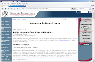
That's what appears in the browser. It's what is 'above the fold.' If the visitor clicks on the scrollbar on the right, they'll see:
Unless the person needs something specific from the Oklahoma Bar Association, and knows it should be there, less than 30% of visitors will ever see that second fold.
That means less than 15% of visitors to this site will ever what is on the two folds below, too.
Above the fold, you have to identify yourself, say or show something of interest, and offer visitors somewhere to go - or you've lost them.

Hot Spots
Take another look at the first page of this site. It's an attractive page: businesslike, and appealing. There is some energy to the presentation. That's important.

(Note: My apologies to regular readers. I'd intended to put this graphic in place initially, but had misplaced the software.-PD)

Where do your eyes go first? and then? And how does your attention move down the page?
If you're like me, they went momentarily to the logo in the upper left, then quickly to the colored navigation on the right. A quick scan of that list -maybe the first 3 or 4 items- then across to the navigation on the left. A slightly longer scan there, then a look at the article headlines. - And back to the colored navigation on the right!
The Hot Spot on that page is the flashy navigation on the right. It draws attention from everything else. The eyes keep going back there no matter what you're looking for.
If what the visitor is looking for isn't on the navigation, they might find the Quick Links drop down or the Search bar.
The movement of the eye is probably more easily seen in the reduced image.

Navigation
The Navigation is in the colored areas. The eyes are drawn to those colored areas, even though the site uses text links. And there's a little stickiness. See the last link on the right? Every other link is capitalized except 'my okbar'. Personalization.

That's actually the 'Tips' page. Take a look at the homepage for a second.
Where do your eyes go? Again, right to that navigation on the right. But they quickly shot over to the Mock Trials article, didn't they?
There is no second fold here. All you see if you scroll down is the footer with a the copyright and contact info. This page is designed completely above the fold. Did you notice there is a new link on the right to quickly look up a case? Probably not until I mentioned it. You'd have to be a member of the site to use it because it requires an ID and Pin number. Again, stickiness through personalization.
This whole page is navigation really. It moves you quickly to where (is assumed) you want to go.

All of these concepts are technical aspects of web design. This is hardly an award-winning creative site, but it is a very good design for useability.

Color
One key aspect that is often overlooked is color.
Imagine picking a color combination for a plumber. You might ask the customer what their favorite colors are; but will probably prove fruitless. Most people will say either blue or green, which doesn't tell you much.
You might try to consider the meanings of color. What can you say about the company using color? Or, more professionally: What does the visitor want to see?

One technical method is to turn a color wheel. Choosing appealing color combinations from a color wheel is easy. Just look for combinations at muliples of 30 degrees.
Adjacent colors harmonize. Colors separated by another color are contrasting colors. You may also see these referred to as complementary. Red and Green are contrasting colors. The more transitional colors separating two colors, the greater the contrast. Colors that are directly opposite from one another clash.
The there is the limitation of 216 web-safe colors.
In the end, the web designer usually has to prototype a few pages with different color schemes, although none of the examples will probably satisfy the eye of the discriminating plumber.

If a designer wants to be a little New Age about it, they might apply the principles of Feng Shui to the colors and patterns. (Maybe another time...)

What meaning do the colors on the Oklahoma Bar Association pages convey? There aren't many: grey, crimson, black and white.
This should have been an easy one for the designer. In this case, a combination of color confers the meaning. Grey and crimson are colors associated with learned academics, graduation, and scholarship around the world. These colors could even be taken from the traditional formal robes of the legal profession.
The swish of crimson on the right mimics the drape of crimson underrobes.
Keeping the text black on a white background maintains the business like appearance. Can you imagine the text in blue? It would be inappropriate, maybe even garish.
If a little more energy were needed, the colors of the text might be alternated between black and dark grey. But that sort of distinction is unnecessary here.

Individual colors convey meaning, too.
Grey is a neutral, balanced color. It is a conservative color. It is the color of formality, even mourning.
Red is power. Business people wear red ties. Celebrities and VIPs (very important people) walk the red carpet.
The combination confers a subtle message beyond the traditions.
And these colors are not overused. There is a lot of white space, indicating openness - something the legal profession always strives for, but fails because of the arcane nature of their training.

Gestalt
The Gestalt of the web pages indicated here is consistent. It is reinforced by the symbol of the legal profession: the scales of justice in the logo position. There are four Gestalt designs. Which of these applies to the web pages illustrated above?
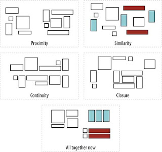
These concepts:
  • Similarity
  • Proximity
  • Continuity
  • Closure
  • and All Together Now
..are psychologically hard wired into our brains. The interpretation of these patterns bridges cultures and racial divides. When the information on a web page (or any other document) doesn't respect these principles, it is seen as awkward or distasteful.
The same sort of gut level reaction is invoked when a website adheres too closely to one of the Gestalts. Consider the dark interfaces of many gaming sites. In an attempt to convey Continuity, the sites often evoke Closure and too much 'togetherness' (All Together Now). These interfaces seem to drain energy from the viewer. (For example, take the 'All Together Now' pattern and fill the remaining squares with black.)

Images
Images are a part of every website. The old saying about a picture being worth a thousand words is only true on the web for the visitor, not the search engine, -- but still holds true.

Logos just don't cut it. There are few really memorable logos anymore. Logos are often stylized to keep them simple because most people will remember vivid abstractions. Other than traditional icons though, most logos have lost their meaning.
Images of people in some sort of activity are best. Visitors identify with the people and the activity in an image far better than telling the story in text.
Animated images can be easily overdone. Unless the animation is necessary to illustrate steps in a process or provides interactivity, they're usually best to avoid. Animated images just to provide movement make the web page look like an intrusive ad. The animation can quickly draw attention from the important information.
As a trainer, I've trained people to make animations in Photoshop and Flash. I always caution everyone not to rely on them. For one thing, to date no search engine can read either format.
How do you place images on a page? - Refer to the Gestalt section above.

Expectations and Surprise
Websites, more than individual pages, have to conform to visitors expectations. A business site has to have a logo and a title bar - even if the title of the page isn't in the title bar. The logo should be a link back to the homepage. Navigation from every page should be clear from every page on the site.
That doesn't mean every page has to be the same. In fact for many reasons including SEO, every page shouldn't be too similar. But too many changes may make for unwelcome surprises that confuse visitors.
Small surprises are acceptable. Take another look at the illustrations of the Oklahoma Bar Association website. The homepage has the logo and title bar, with a quick login to reference material. The internal pages change slightly. These pages have additional navigation hints on the left and breadcrumbs at the top.
If there were a general rule for changing the look and feel of a website, it might be to limit such changes to navigation.
Changes in color -for text, title bar, or background- to distinguish different parts of a website have to be done with caution. Colors convey different meanings. And no one can predict how different browsers or monitors will display some colors.

You are what you publish
What kind of web designer am I? A technical web designer. One who applies these principles and ideas above somewhat resentfully to my work. I pay attention to the goals of SEO and SEM when I design a site.
I told an SEO client recently: "I can tell you the reason for every word on (your) website." I had to hold my tongue from saying it would bore him to death if I did.
There is a great deal more that can be done with web design.
Web design has only begun to explore the dimensions of Web 2.0, for example. It's exciting for me to contemplate producing websites that are more interactive; more like desktop applications or games. For now, we are stuck with the business letterhead model.
But the expectations of users and customers will have to grow and change. It's already happening in places like the US and UK. Australia may follow suit soon, as real broadband speeds become more commonplace.

SEO/SEM in Australia is a special issue for so many reasons. Join me was we explore. It will be a fascinating and informative journey. Sphere: Related Content

Wednesday, March 19, 2008

Hackers and the 30%

In the dim dark days long past, web design was not a profession.
In the beginning, before the advent of public search engines, the Web population was made up of the top 30% or so of the best educated and best paid in the US. People joined the 'Internet Revolution' to see what these future great minds were thinking and saying.
In those days, a hacker was more of a Robin Hood than a Darth Vader. 'Hacking' was a sport, sorta. It meant breaking into someplace just because you could. Hackers didn't take things. They usually left something to say they'd been there. A dark rose on a chemistry professor's desk, for example.
The Net was more humorous than commercial.
One of the most popular downloads was a tutorial on picking locks - not on a site called Burglary.com -but on the MIT site.

As books emerged predicting the introduction of HTML 3.2 (the current version is 4.x), Web Designer became a profession. A dot-com was just another domain. (Not for long though.)
The debate raged for years about whether the Web should allow business sites.
A lot of people didn't think it should. But the push into the new medium was inexorable. After all, the Web was populated with the most cashed up consumers in the country!

Web pages were often long. Hyperlinks moved the reader from one part to the other instantly. Philosophers rambled on for hours -in text- about how hyperlinks were creating a new mindset. A 3-dimensional concept of information: a Revolution in expression. Text and images aligned themselves analogically to the thinking processes of the human mind.
Some web designers became architects of the Revolution. They designed information to be understood in quick reference and depth.

The key to this Revolution was how to structure the information.
Page titles reflected the context. Headings set the information into outline form. Each heading was also an anchor that could be addressed via hyperlink, so the reader could move seamlessly through.
Keywords and meta data emerged. They presented the home grown search engines with quick references to the content. No one was willing to commit precious mass storage to comparing the whole content of web pages.
The nascient science of information retrieval traded amongst the gnomes and dwarves of the Net.

New Web Designers were trained to this structure to organize their pages. They have to be educated to it.

Twenty years or more later, new Web Designers have forgotten. Like the stories of ancient religions and societies, the lessons have to be learned again. The story could read like a fantasy novel written during a war. Dark forces sweeping across the World, changing, destroying, and building new places and things - until they burnt themselves out in their glory.
"Google has changed the way the Web does business" is the buzzing headline. It may be more like brushing off old shoes though. The structure is again relevant. In fact, it establishes Relevancy for a web page.
The Web has changed, but gone full circle. It's more egalitarian, and commercial. Instead of the top 30%; there are less than 25% who choose not to have Internet access.
New leaders earn their fortunes by digging up the treasures of the Past. SEO is really just applying the principles established in the beginning to a new Web.

SEO/SEM in Australia is a special issue for so many reasons. Join me was we explore. It will be a fascinating and informative journey. Sphere: Related Content

Sunday, March 16, 2008

Web Design 101 - First Period

I am, by my own admission, a lousy web designer.

Why? - Because I hate templates.

The first website I saw was made by Microsoft's FrontPage 97. All you had to do was tell it: Make me a corporate web! - and FrontPage would dutifully generate homepage, about us, products, and services, and contact pages. Poof! A small company was IBM.
The title of the page was in a box at the top, and all the structural tags - H1, H2, etc. - were colored, sized, and decorated for you. In most templates, it even gave you little graphics for unordered lists.
All you had to do was fill in the blanks, and you were a working company on the Web.
It was a raving bore in 94; and it's only more today. (Not a great poet, either, you'll notice.)

One of the first rules of web design is to make your pages look pretty much the same. The idea is that you won't confuse your visitors, and maybe even establish your corporate or personal style.
That was find in those days if your sense of style is either blue jeans or polyester slacks.
Problem was, that layout implied a company had to have Products and Services. Some companies didn't. That alone created a sense of insecurity or desperation.

Design the information to express

I've never been much of one to put things in little boxes. Design should express and enhance, not restrict.

I tend to want to design a website page by page to reflect the present attitude of the company. If it's a small company that just got a new logo done, then let's let it fill half of space above the fold. Why not? This is company just coming into its own.
They're proud of their new logo. It's all over their vans, new business cards and new company literature. Put it out there for the world to see!
They've only got a few services, but those services are needed in their area. Their customers like them. One of them said so right in the middle of the home page.
Just put a list on the side full of links to get more info.

A design like that gets poo-poo'd a lot. Even customers don't like it because they don't think it looks "business-like". (Not that anyone has ever defined "business-like" too well.) It becomes a matter of latent expectations, not perceiving.

Why does a web page have to follow the pattern of a business letter? Why not let it be a presentation right from the homepage? You got a new company, tell the world about it.
You can always add or adjust stuff later.
It has to look like a business letter because customers won't know what to do. Or, It has to look like a business letter because that's what this site looks like. (The one I'd like to be...)

Wired wonders
Wired proposed over a decade ago that we use the web space better. (I lost track of the article or I'd provide a link.)
Web pages only had to show a window into the content. It's what they do anyway. There could be content spread wide and far across thousands of pixels of space. One click, and the viewport shifted to another part of the grandscape.
They were far ahead of their time.

Web pages in those days were constrained by download speeds on 33k and 56k modems. If a webpage had more than 30K of content - images, programming, and HTML - visitors just went somewhere else.
The download time has changed a little with the spread of broadband, but the size limitation for templates still holds them below 60K. And all of it has to fit on a business letter, within two clicks down the sidebar.

The article proposed broad, bold colors. Wide colored channels guided the visitor across the webscape to explore information or make a purchase. The user actually interacted with the page instead of just clicking away.
Changing colors in the viewscape indicated where the visitor was in the process. All the information was contained on the page, so there was no need for flickering screens. The body tag encompassed many pages, really viewports, of the viewscape. If the visitor wanted, they could ramble around without following the colored guide lanes - and take the path less followed.
Using a mouse or the arrow keys, they could go anywhere just like exploring a landscape on Google Earth. Zoom in or out to get their bearings, then off to explore again.
I don't imagine such a site would have a problem with stickiness...

Where does all of this fit into SEO and SEM? That's going to be a topic or two for another time.

The plan in those days long ago was to use Javascript and Java to implement responsiveness and new content on demand. That can still be done, of course, but there are much more exciting options now. (continued later)

SEO/SEM in Australia is a special issue for so many reasons. Join me was we explore. It will be a fascinating and informative journey. Sphere: Related Content

Monday, October 1, 2007

Polls: How longdoes it typically take you to make a webpage from scratch?

From About.com:

I love Jennifer Kyrnin. She knows how to keep her readers interested by motivating feedback.

It seems like a pretty straight-forward question at first glance: How long?
Interestingly, it's easy to see that the more experienced web designers said it took them longer to make a web page.

Inexperienced page designers will simply layout a page, insert a few graphics and set the text layout to suit. Concerns such as SEO - many inexperienced page designers avoid the head tag altogether - keywords, and competition can be forgotten.
(The worst is subcontracting to someone who has sold a web page/site design to a client from all Flash, but that's another post..)

Experienced page designers are aware that every page is in competition with other pages all over the Net with the same topics and similar content. A good designer will keep this fact in mind and research competing pages from keywords and search listings.
To ignore the basics of SEO when designing a web page is hardly fraud but it comes close. At best, it's unprofessional. Without SEF considerations, a web page is just a prototype or mock-up. If that's what the client is paying for, good. But an ethical designer will tell them they don't have a functional web page no matter what widgets or devices are included.

27% of the poll respondents indicated they could make a web page in 'an hour or so' or less.

46% indicated it took 'half a day' or 'a day or two' to design a web page from scratch. If the page is in XHTML using good software, that sounds about right.
Now, if there are other considerations, such as scope creep (Client or designer keeps adding new things and ideas.), or the page is intended to work with a CMS or embedded devices that are integral to the presentation, a page can take longer.
It's a good rule of thumb that you can add the number of scope creep plus the number of devices as a percentage to the increased cost of a web page. Any total over 10 means the cost doubles - which often means adding a new page or two.

Pricing alone quickly becomes a sticking point, especially when there is a wide disparity between the skill level of the designer and the client. Price and useability (as the client understands it) can quickly push the time required into the 'a week' and 'more than a week' categories from the poll.
A better professional position for the designer is to avoid adding to the scope creep, even if it's hard to manage the creative juices burning inside. Somewhere between the unhappy knot of understating "Give the client what they want.", and those creative juices is a happy compromise for all.

It's a paradox of human nature that the web pages that take the longest are probably those where the designer is given free reign, - no matter what the price!
Designing for oneself is probably the worst example. The designer cannot keep the scope creep under control.
Designing for someone who has already paid - even if it's a small price - with freedom of design is a close second. The showmanship of the designer comes into play. S/he cannot avoid the tendency to want to show what they can do. Time constraints be damned.
It becomes a no-sum game between the goal(s) of the page and the skills of the designer.
Next comes the situation where it is the first work done for a large, prospective long-term client. The designer has to remember that the work follows the bureaucratic model: Whatever you do becomes expected, and you have to build from there (- which may be impossible...)
These situations take the longest.

Then there is the undiscovered technology page, where the designer wants to use a new technology and the client has no idea what is happening. Oh well.

SEO/SEM in Australia is a special issue for so many reasons. Join me was we explore. It will be a fascinating and informative journey. Sphere: Related Content

Polls: Should you extend credit to clients?

From About.com:

The question isn't as simple as it sounds. There is no web designer/services programmer who has not been burnt by a client. Sometimes it seems like the clients we are most willing to do more for are the ones most likely not to pay. That's some sort of psychological twist built into the creative-technical syndrome (-Did I just invent a new topic for the DSM VI?).

But getting a contract from clients who are woefully unaware of the goals of their own site can be impossible.
In Australia, the level of client awareness is woefully behind the rest of the free world for many reasons. Australians have only had broadband access for a couple of years for anyone outside the central business districts (CBD). Even the best of promised access speeds coming in the next few years are only barely considered 'broadband' by the rest of the world.
Through no fault of their own, the vast majority of Australian businesses have no concept of the power of the Internet.

94.6% of registered businesses in Australia are small businesses. Following the ancient maxim/rule of internet marketing, 70% (or more in a developing market) of sales from a website will be within 20 miles of the physical address of the business. That's approximately 35 kilometers.
The rule applies to about 85-90% of the 3.8 million Australian business owners.
In plain English, these folks just don't see the reason for a website.
At best, the business owner sees that their clients expect some sort of website. Their vision for the website is more along the lines of a business card or brochure. Monetizing the site, or even making it SERP-friendly, is far beyond the mindset.

Extending credit to such clients is risky - with or without a contract.
The poll on About.com is not a good representative sample because of the small number of respondents; and possibly the make up of the respondents, but the message comes through loud and clear: Credit is very risky.

A useful compromise to put everyone's mind at ease is a staged payment system.
Once the goals of the site are outlined and sketched out as webpages, a baseline cost can be determined. This price has to leave some room for a little scope creep, but not too much.
Suggested features should be fixed price alternatives - defined as clearly as possible - and not more than 3-5 listed.
A base rate of some sort has to be agreed upon, either as per-hour, per-page, or some combination.

When the price is agreed upon, at 1/3 to 1/2 is paid up front. An alpha point is determined by the satisfaction of the contracted goals of the site. If there are a large number of pages/features in the site, another payment point should be based on the estimated number of days to complete pages or features.
Like most of us, web designers/programmers like to see pay packets fortnightly or monthly. That's a good rule of thumb for how to break up payment schedules.

Finally, the last payment should be substantial - 1/4 to 1/3 of the completion.

If a client can't agree to partial payments as the goals of the site are satisfied, it's time to find another client. The web designer has already put in hours of research and consultation at this point that s/he will never be paid for; and the 'client' has gained from the free education.

It's nearly impossible to get full payment up front from a contracted project, but we can all hope for somedays..

SEO/SEM in Australia is a special issue for so many reasons. Join me was we explore. It will be a fascinating and informative journey. Sphere: Related Content