I am, by my own admission, a lousy web designer."Well, what kind of web designer are you then? The stuff in that article about Wired didn't sound very professional. It sounded like a bunch of techie BS to me."
-- Fair enough.
I'm a technical web designer. I pay attention to things like above the fold, easy navigation, hot spots, and how the visitor's eyes will move down the page to get information. Which, of course, means I often use templates - which I hate. I hate templates for the same reason I hate modern cars. They all look the same to me.
Above the Fold
The Above the Fold concept grew out of studies of visitor behavior. About 60% of visitors to a website never click down the page. They scan what appears in their browser window, if that's not what they want, they move on quickly.
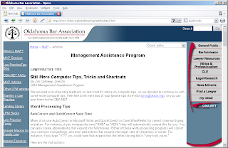
Let me take a random example from the Web. This is the Oklahoma Bar Association website.
 That's what appears in the browser. It's what is 'above the fold.' If the visitor clicks on the scrollbar on the right, they'll see:
 Unless the person needs something specific from the Oklahoma Bar Association, and knows it should be there, less than 30% of visitors will ever see that second fold.
That means less than 15% of visitors to this site will ever what is on the two folds below, too.
Above the fold, you have to identify yourself, say or show something of interest, and offer visitors somewhere to go - or you've lost them.
Hot Spots
Take another look at the first page of this site. It's an attractive page: businesslike, and appealing. There is some energy to the presentation. That's important.

(Note: My apologies to regular readers. I'd intended to put this graphic in place initially, but had misplaced the software.-PD)
Where do your eyes go first? and then? And how does your attention move down the page?
If you're like me, they went momentarily to the logo in the upper left, then quickly to the colored navigation on the right. A quick scan of that list -maybe the first 3 or 4 items- then across to the navigation on the left. A slightly longer scan there, then a look at the article headlines. - And back to the colored navigation on the right!
The Hot Spot on that page is the flashy navigation on the right. It draws attention from everything else. The eyes keep going back there no matter what you're looking for.
If what the visitor is looking for isn't on the navigation, they might find the Quick Links drop down or the Search bar.
The movement of the eye is probably more easily seen in the reduced image.
Navigation
The Navigation is in the colored areas. The eyes are drawn to those colored areas, even though the site uses text links. And there's a little stickiness. See the last link on the right? Every other link is capitalized except 'my okbar'. Personalization.
That's actually the 'Tips' page. Take a look at the homepage for a second.
 Where do your eyes go? Again, right to that navigation on the right. But they quickly shot over to the Mock Trials article, didn't they?
There is no second fold here. All you see if you scroll down is the footer with a the copyright and contact info. This page is designed completely above the fold. Did you notice there is a new link on the right to quickly look up a case? Probably not until I mentioned it. You'd have to be a member of the site to use it because it requires an ID and Pin number. Again, stickiness through personalization.
This whole page is navigation really. It moves you quickly to where (is assumed) you want to go.
All of these concepts are technical aspects of web design. This is hardly an award-winning creative site, but it is a very good design for useability.
Color
One key aspect that is often overlooked is color.
Imagine picking a color combination for a plumber. You might ask the customer what their favorite colors are; but will probably prove fruitless. Most people will say either blue or green, which doesn't tell you much.
You might try to consider the meanings of color. What can you say about the company using color? Or, more professionally: What does the visitor want to see?
One technical method is to turn a color wheel. Choosing appealing color combinations from a color wheel is easy. Just look for combinations at muliples of 30 degrees.
Adjacent colors harmonize. Colors separated by another color are contrasting colors. You may also see these referred to as complementary. Red and Green are contrasting colors. The more transitional colors separating two colors, the greater the contrast. Colors that are directly opposite from one another clash.
The there is the limitation of 216 web-safe colors.
In the end, the web designer usually has to prototype a few pages with different color schemes, although none of the examples will probably satisfy the eye of the discriminating plumber.
If a designer wants to be a little New Age about it, they might apply the principles of Feng Shui to the colors and patterns. (Maybe another time...)
What meaning do the colors on the Oklahoma Bar Association pages convey? There aren't many: grey, crimson, black and white.
This should have been an easy one for the designer. In this case, a combination of color confers the meaning. Grey and crimson are colors associated with learned academics, graduation, and scholarship around the world. These colors could even be taken from the traditional formal robes of the legal profession.
The swish of crimson on the right mimics the drape of crimson underrobes.
Keeping the text black on a white background maintains the business like appearance. Can you imagine the text in blue? It would be inappropriate, maybe even garish.
If a little more energy were needed, the colors of the text might be alternated between black and dark grey. But that sort of distinction is unnecessary here.
Individual colors convey meaning, too.
Grey is a neutral, balanced color. It is a conservative color. It is the color of formality, even mourning.
Red is power. Business people wear red ties. Celebrities and VIPs (very important people) walk the red carpet.
The combination confers a subtle message beyond the traditions.
And these colors are not overused. There is a lot of white space, indicating openness - something the legal profession always strives for, but fails because of the arcane nature of their training.
Gestalt
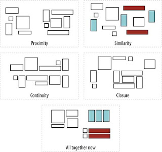
The Gestalt of the web pages indicated here is consistent. It is reinforced by the symbol of the legal profession: the scales of justice in the logo position. There are four Gestalt designs. Which of these applies to the web pages illustrated above?
 These concepts:
- Similarity
- Proximity
- Continuity
- Closure
- and All Together Now
The same sort of gut level reaction is invoked when a website adheres too closely to one of the Gestalts. Consider the dark interfaces of many gaming sites. In an attempt to convey Continuity, the sites often evoke Closure and too much 'togetherness' (All Together Now). These interfaces seem to drain energy from the viewer. (For example, take the 'All Together Now' pattern and fill the remaining squares with black.)
Images
Images are a part of every website. The old saying about a picture being worth a thousand words is only true on the web for the visitor, not the search engine, -- but still holds true.
Logos just don't cut it. There are few really memorable logos anymore. Logos are often stylized to keep them simple because most people will remember vivid abstractions. Other than traditional icons though, most logos have lost their meaning.
Images of people in some sort of activity are best. Visitors identify with the people and the activity in an image far better than telling the story in text.
Animated images can be easily overdone. Unless the animation is necessary to illustrate steps in a process or provides interactivity, they're usually best to avoid. Animated images just to provide movement make the web page look like an intrusive ad. The animation can quickly draw attention from the important information.
As a trainer, I've trained people to make animations in Photoshop and Flash. I always caution everyone not to rely on them. For one thing, to date no search engine can read either format.
How do you place images on a page? - Refer to the Gestalt section above.
Expectations and Surprise
Websites, more than individual pages, have to conform to visitors expectations. A business site has to have a logo and a title bar - even if the title of the page isn't in the title bar. The logo should be a link back to the homepage. Navigation from every page should be clear from every page on the site.
That doesn't mean every page has to be the same. In fact for many reasons including SEO, every page shouldn't be too similar. But too many changes may make for unwelcome surprises that confuse visitors.
Small surprises are acceptable. Take another look at the illustrations of the Oklahoma Bar Association website. The homepage has the logo and title bar, with a quick login to reference material. The internal pages change slightly. These pages have additional navigation hints on the left and breadcrumbs at the top.
If there were a general rule for changing the look and feel of a website, it might be to limit such changes to navigation.
Changes in color -for text, title bar, or background- to distinguish different parts of a website have to be done with caution. Colors convey different meanings. And no one can predict how different browsers or monitors will display some colors.
You are what you publish
What kind of web designer am I? A technical web designer. One who applies these principles and ideas above somewhat resentfully to my work. I pay attention to the goals of SEO and SEM when I design a site.
I told an SEO client recently: "I can tell you the reason for every word on (your) website." I had to hold my tongue from saying it would bore him to death if I did.
There is a great deal more that can be done with web design.
Web design has only begun to explore the dimensions of Web 2.0, for example. It's exciting for me to contemplate producing websites that are more interactive; more like desktop applications or games. For now, we are stuck with the business letterhead model.
But the expectations of users and customers will have to grow and change. It's already happening in places like the US and UK. Australia may follow suit soon, as real broadband speeds become more commonplace.
SEO/SEM in Australia is a special issue for so many reasons. Join me was we explore. It will be a fascinating and informative journey. Sphere: Related Content
No comments:
Post a Comment